7 Things Every Restaurant Website Needs
A restaurant website does not need to be fancy to work. It needs to answer the questions a hungry person has before they lose patience and choose somewhere else.
Most diners are on a phone. They are checking the menu in the car, looking up hours from the sidewalk, or sending a link to a friend. If your site makes any of that hard, it is costing you tables.
1. A menu people can read on a phone
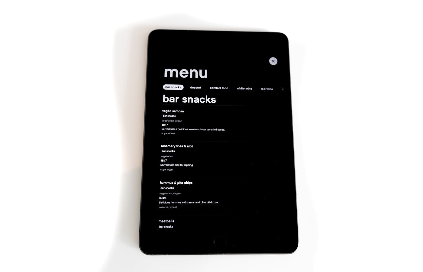
PDF menus are still everywhere, and they are still a problem. If someone has to pinch, zoom, download a file, or wait for a huge scan to load, the menu is doing the opposite of its job.
Use real text on the page whenever possible. It is easier to read, easier to update, and easier for Google to understand. You can still offer a printable PDF, but it should not be the only way to see the food.
2. Hours and address in obvious places
Your hours, phone number, and address should be easy to find on the homepage and in the footer. Do not make people dig through an About page to figure out whether you are open.
This matters even more for brunch, holidays, late-night service, seasonal hours, and takeout windows. If the information changes often, build the site so updating it is painless.
3. A clear reservation or walk-in answer
If you take reservations, the booking button should be visible early. OpenTable, Resy, Tock, a simple form, or a phone number can all work. The key is not making people guess.
If you are walk-in only, say that clearly. It is better to set expectations than to make someone click around looking for a booking option that does not exist.
4. Directions without copy-and-paste
A linked address or embedded map saves a step. People should be able to tap once and get directions. This is not glamorous web design. It is just useful.
5. Real photos of the food and space
Restaurant sites live or die on photos. Stock food photos usually feel wrong because customers can tell they are not looking at your actual menu or room.
You do not need a huge shoot to start. A handful of well-lit photos of your best dishes, the dining room, the bar, and the storefront will do more than another paragraph about fresh ingredients.
6. A little proof
A few real review snippets, press mentions, or short quotes can help. Keep it honest and specific. You do not need a wall of testimonials. You just need enough proof that a first-time visitor feels safe choosing you.
7. Fast loading
Big food photos can make a restaurant site painfully slow. Resize and compress every image before it goes live. A beautiful homepage that takes ten seconds to load is not beautiful to the person waiting on cell service.
The point
Every item on this list removes friction. The fewer steps between "that looks good" and "let's go there," the better your website is doing its job.
If your restaurant site is missing the basics, use the plan finder to see what kind of rebuild would actually make sense.